
Regardless of the type of products or services you offer, having a mobile friendly website is now a primary focus for any business. It is important not just for convenience for a few online shoppers, but because about 47% of all searches online are now completed from tablets or smartphones, and not from desktops.

By the end of 2015 it is anticipated by online marketing experts that well over 50% of all purchases made online will be completed through mobile devices. When you don’t have a way to connect to this market, you are potentially losing out on up to 50% of potential new clients.
Here are some other interesting facts about the increasing use of mobile devices:
-
When comparing data usage across devices within the United States approximately 51% is mobile devices compared to about 42% from desktops.
-
There are approximately 4 billion mobile devices in use around the world, with 91% of adults having a cell phone according to Pew Research.
-
The United States has the third ranking for countries around the world for cell phones in use, exceeded only by China at number one and
India at number two. -
About 33% of all mobile device users start their search on a branded website and 26% start with a branded app. While search engines are still the top at 48%, this number is on the decline, especially in the category of beauty and apparel as well as finance.
What is Mobile Friendly?
Having a mobile friendly website doesn’t mean you have to have a different page or a different site. Instead, it relies on a program known as Responsive Web Design or RWD.
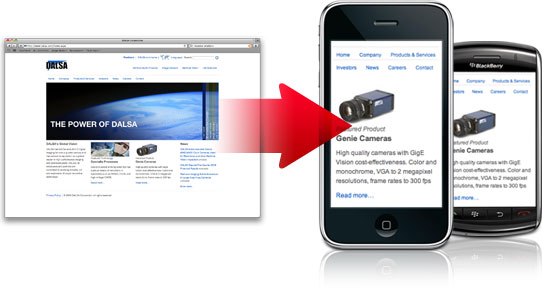
In a nutshell, this allows the website developer to customize what any person will see when viewing your website from a particular type of device. Items on the website as well as the website pages will automatically resize, shift, scroll and display to optimize viewing on a smaller or larger screens.
For small screens, such as smartphones, the responsive web design program will convert navigation systems to enhance the user experience. Buttons or “click” icons will change to touch screen friendly options that can easily be controlled with swiping or scrolling.
These sites will automatically change the content as well to avoid crowding or cluttering of smaller screens on smartphones and tablets. The “extras” will not be visible on a mobile site, leaving more room for the information your customers need to learn about the products and services you offer.
With our extensive experience in designing mobile friendly websites we can get your website ready for online marketing on any device. To schedule an appointment with our team, give us a call today.